
Peabuk
Peabuk is an innovative digital marketplace for event vendors, designed to transform the event planning journey for individuals, organizations, and diaspora clients returning home to celebrate. Featuring verified vendors, intelligent planning tools, and additional options like gift registries and destination assistance, Peabuk empowers users to effortlessly realize their visions, regardless of their location. By consolidating services such as venues, makeup artists, caterers, decorators, photographers, and more, Peabuk fosters seamless connections. For diaspora clients, Peabuk provides the convenience, transparency, and cultural insight essential for effective planning from abroad.
Service
Brand Design (Partner), Brand Guide, & Visual Marketing Designs
Sector
Event & Event Tech
Year
2025

Amidst the Noise
Event vendors and planners struggled to find a unified, recognizable platform that felt both dynamic and reliable. The existing visual landscape was crowded with generic, festoon-style motifs and inconsistent branding that failed to convey organizational expertise or scale. Without a clear, cohesive identity,
Peabuk risked blending into the noise rather than emerging as a professional, go-to resource platform in the event industry.

A Vision Aligned
The goal was to create an identity that immediately communicates Peabuk's dual promise: a vibrant community pulsating with creative energy, and a rock-solid platform built on organized precision.
We aimed to establish a visual language, through logo, colour, and imagery, that would resonate with both ambitious vendors seeking visibility and planners craving reliability.
Unfolding the Design
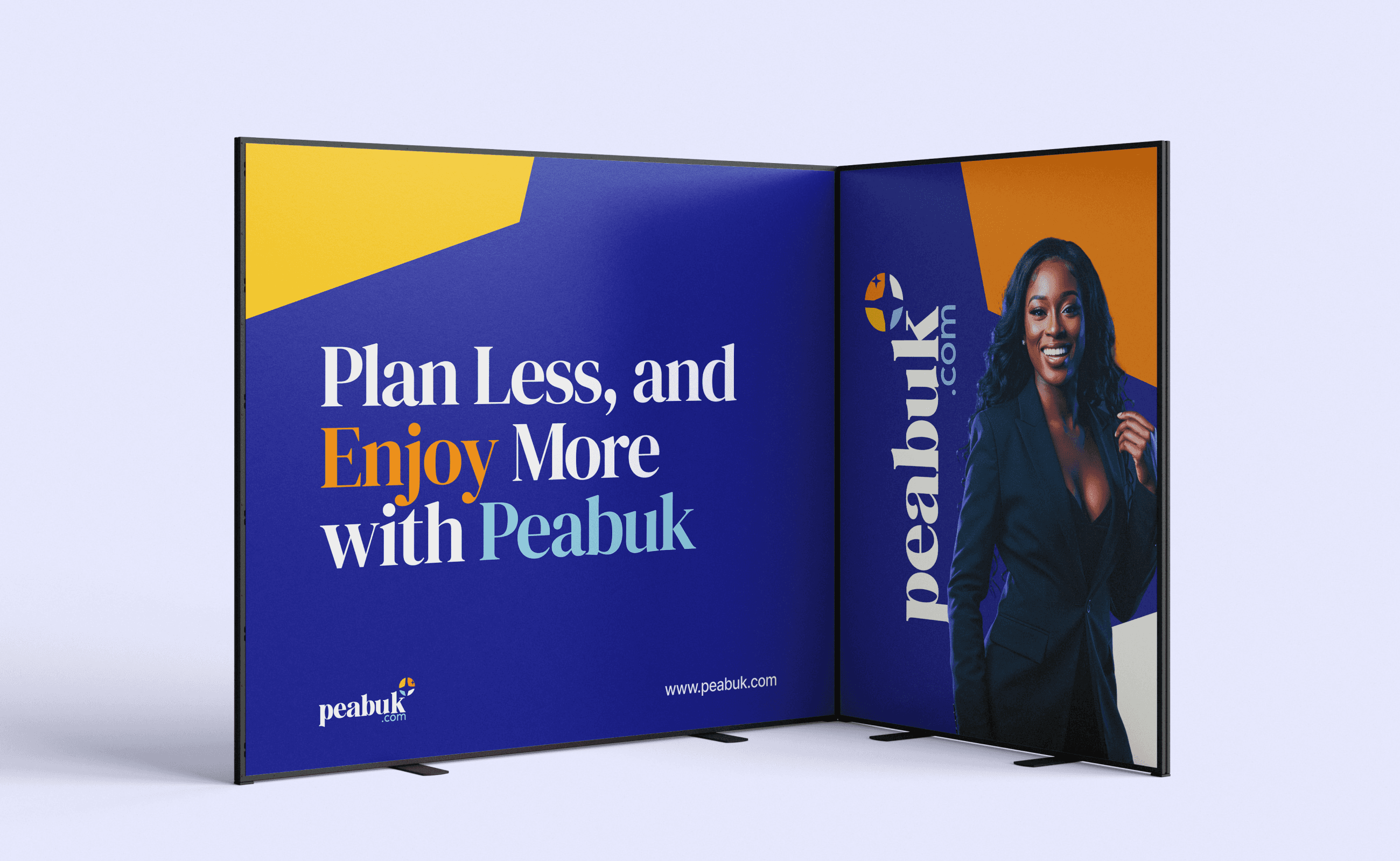
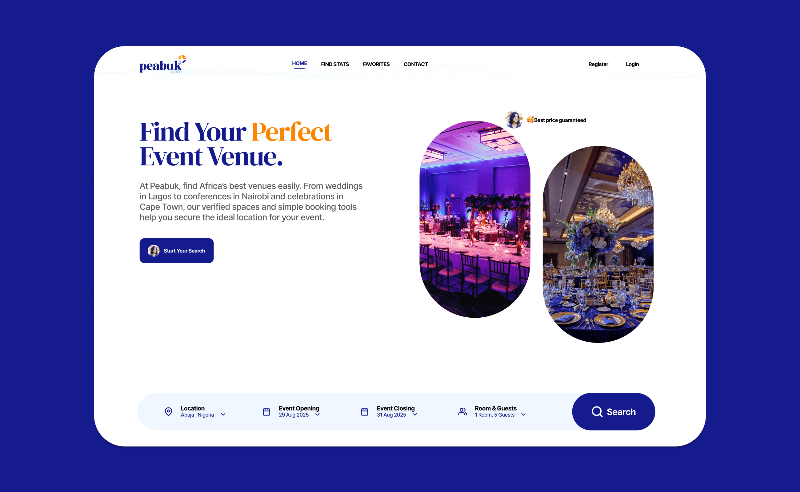
We designed a serif, lowercase wordmark for clarity and modern appeal, paired with a grid-based emblem that subtly references venue layouts and planning checklists.
We also worked on a comprehensive brand guideline for brand information, logo usage, typography hierarchy, colour application, and photography style, to guarantee consistency and adaptability in every context.


Colours that Speaks "Event with Ease"
1. Peabuk Blue (#151B8D)
Psychology:
Blue represents trust, reliability, and professionalism. Deep blue shades often evoke feelings of authority, stability, and dependability. Assuring Peabuk's audience that, “We’ve got you covered, no need for stress or doubt.”
How it ties to Peabuk:
Since Peabuk’s goal is to simplify event planning and become a trusted hub for clients and vendors, this blue builds confidence. It signals that Peabuk is dependable, trustworthy, and serious about making event planning smooth and hassle-free.
2. Peabuk Light Blue (#8ECAE6)
Psychology:
Light blue gives off a calming and refreshing vibe. It’s associated with clarity, openness, and communication. It feels approachable, soft, and human-centered.
How it ties to Peabuk:
This lighter tone balances the strong Peabuk Blue by showing approachability and friendliness. It says, “We’re not just a business; we’re your friend making life easier.” It also resonates with the transparent and collaborative nature of the platform.
3. Peabuk Orange (#FB8500)
Psychology:
Orange is vibrant, energetic, and social. It encourages creativity, fun, and enthusiasm. Orange is a call-to-action color that naturally sparks excitement and inspires people to take the next step, and it is seen in how it is used in the marketing collateral designs.
How it ties to Peabuk:
Events are all about energy and celebration, and orange communicates this perfectly. It reflects Peabuk’s innovative spirit and the excitement that comes with connecting clients to vendors who make memories happen.
4. Peabuk Deep Yellow (#FFB703)
Psychology:
Yellow symbolizes optimism, warmth, and joy. A deep yellow, in particular, feels bold and inviting, it inspires confidence while radiating positivity.
How it ties to Peabuk:
Deep yellow captures happiness and the “celebration vibe” of events. It reassures clients that using Peabuk is a step towards joyful, stress-free experiences. It’s also an uplifting colour that energizes the overall brand personality.
How the Palette Works Together
The blue tones (trust, professionalism) create the foundation, showing Peabuk as reliable and authoritative in the event booking space.
The orange and yellow tones bring energy, warmth, and fun, aligning with the social, vibrant, and celebratory nature of events.
Together, the colors strike a balance between trust and excitement, exactly what prospective audiences want: a dependable partner who also brings life and energy to their event planning journey.

Though Generic, It fits Just Right
Peabuk uses DM Serif Display as its primary typeface, a high-contrast transitional face. With delicate serifs and fine detailing, the design has been shaped for use in super-sized poster settings, and Inter as its secondary typeface, a modern, geometric sans-serif designed for optimal readability across screens and print. Its clean lines and generous x-height ensure clarity at small sizes, while its extensive weight range (from Thin to Extra Bold) provides versatile hierarchy and emphasis.
Inter’s neutral yet friendly character perfectly complements the brand’s balance of professional reliability and energetic warmth.
Impact on Overall Brand Identity
By using DM Serif Display and Inter consistently, Peabuk reinforces its dual personality: energetic yet dependable.
The typeface’s versatility, from small footnotes to large banners, supports the vibrant colour accents without competing for attention. Ultimately, the typefaces ties together the logo, palette, and imagery into a cohesive visual language, making the brand instantly recognizable and effortlessly legible across every touchpoint.


Celebrating Success
The new visual identity, while launching gradually across web, social, print collateral, and environmental signage, has immediately begin to earn immediate praise from vendors for its professional polish and engaging personality.
Usage consistency is rising by 30%, and the platform waitlist sign-ups has grew 25% in the first 60days, pre-launch, underscoring how a clear, cohesive identity can drive both trust and excitement in a competitive marketplace.
MORE PROJECTS

