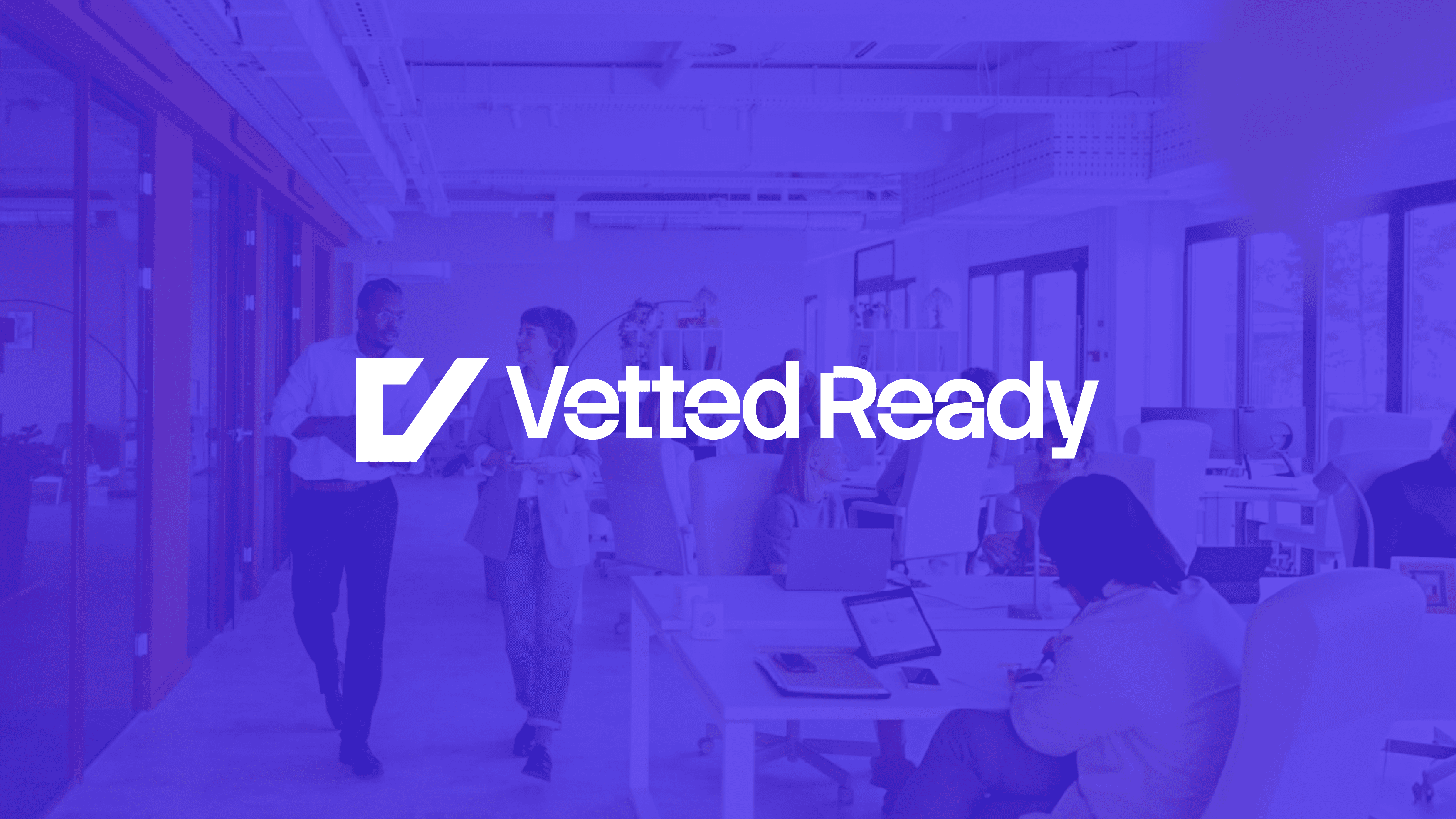
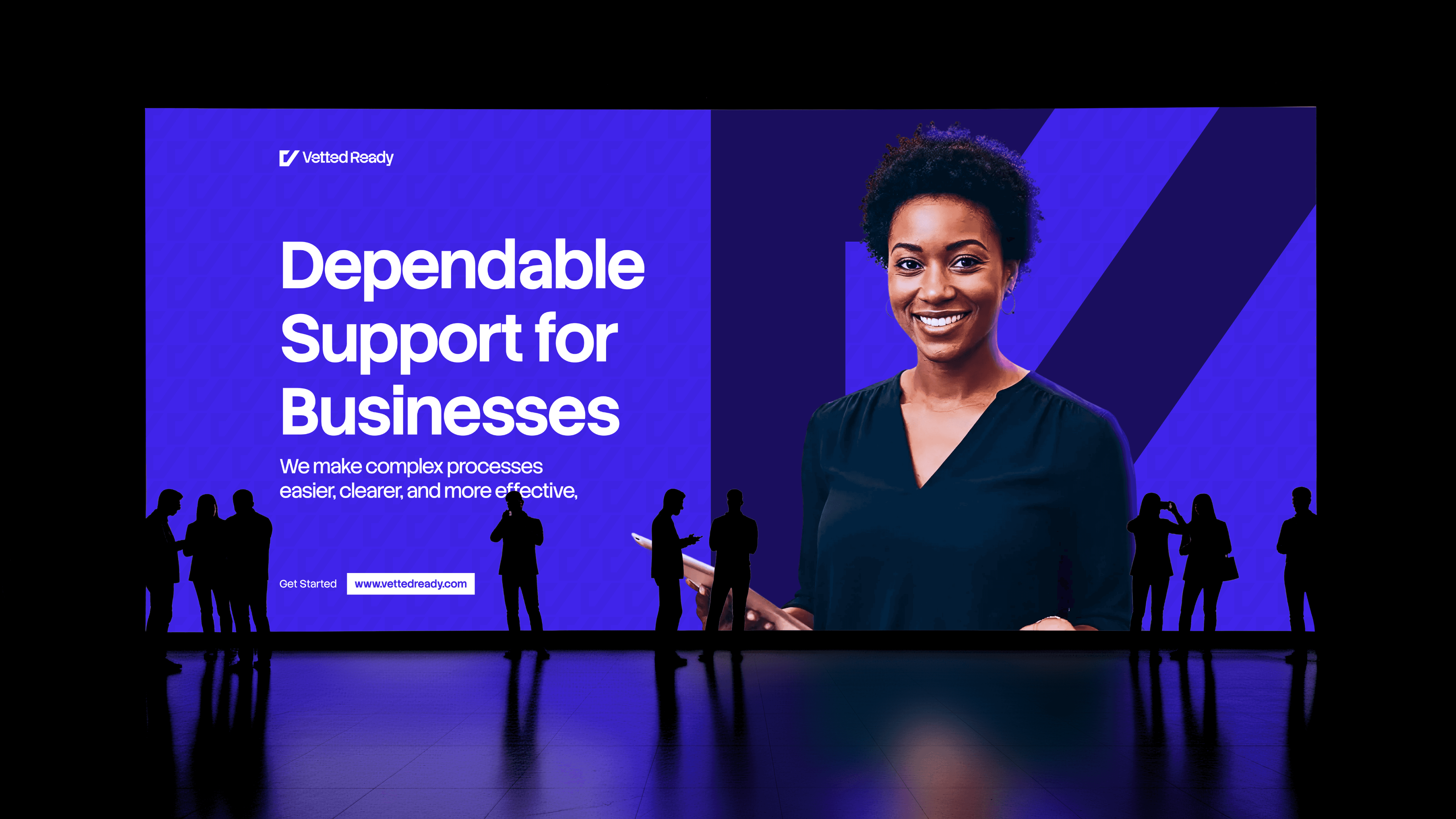
Vetted Ready
Vetted Ready is a UK Based dual-sided consultancy brand, bridging the gap between corporate transformation and professional capability. They provide organizations with end-to-end HR and digital delivery support while empowering career switchers through practical, real-world Business Analysis training. By combining rigorous governance with on-the-job coaching, the brand ensures that both complex projects and the professionals delivering them are strictly vetted and fully ready for success.
Service
Logo Design, Brand Design (Partner), Brand Guide, & Visual Marketing Design
Sector
Consultation & Tech
Year
2026

What we Faced
Vetted Ready needed a visual identity that could speak to two very different audiences simultaneously:
Corporate Organizations seeking risk-free transformation delivery, and
Professionals seeking career acceleration.
The market is crowded with "fluffy" training; and Vetted Ready needed to look like a "stamp of approval", authoritative, structured, and outcome-focused.

The Destination
To help organizations and professionals achieve peak delivery performance, Vetted Ready aims to:
Establish a new global standard for practical, real-world HR and digital transformation delivery.
Bridge the gap between theoretical learning and on-the-job confidence through AI-enabled capability building and mentored support.
Provide organizations with high-integrity governance and end-to-end delivery discipline to ensure measurable project success.
Empower modern delivery professionals with the "delivery-ready" toolkits and certifications needed to navigate complex corporate environments.
The Arrival
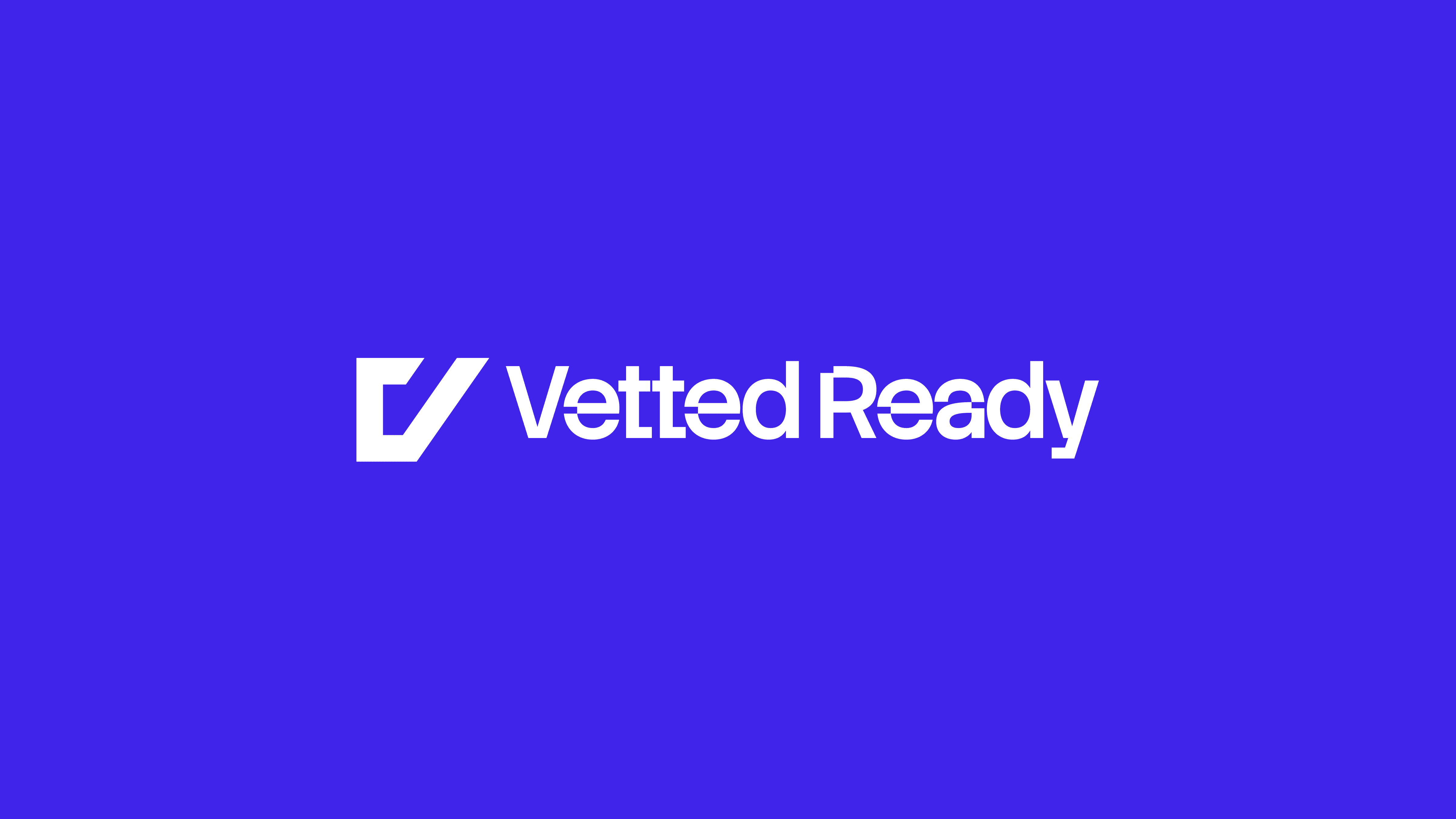
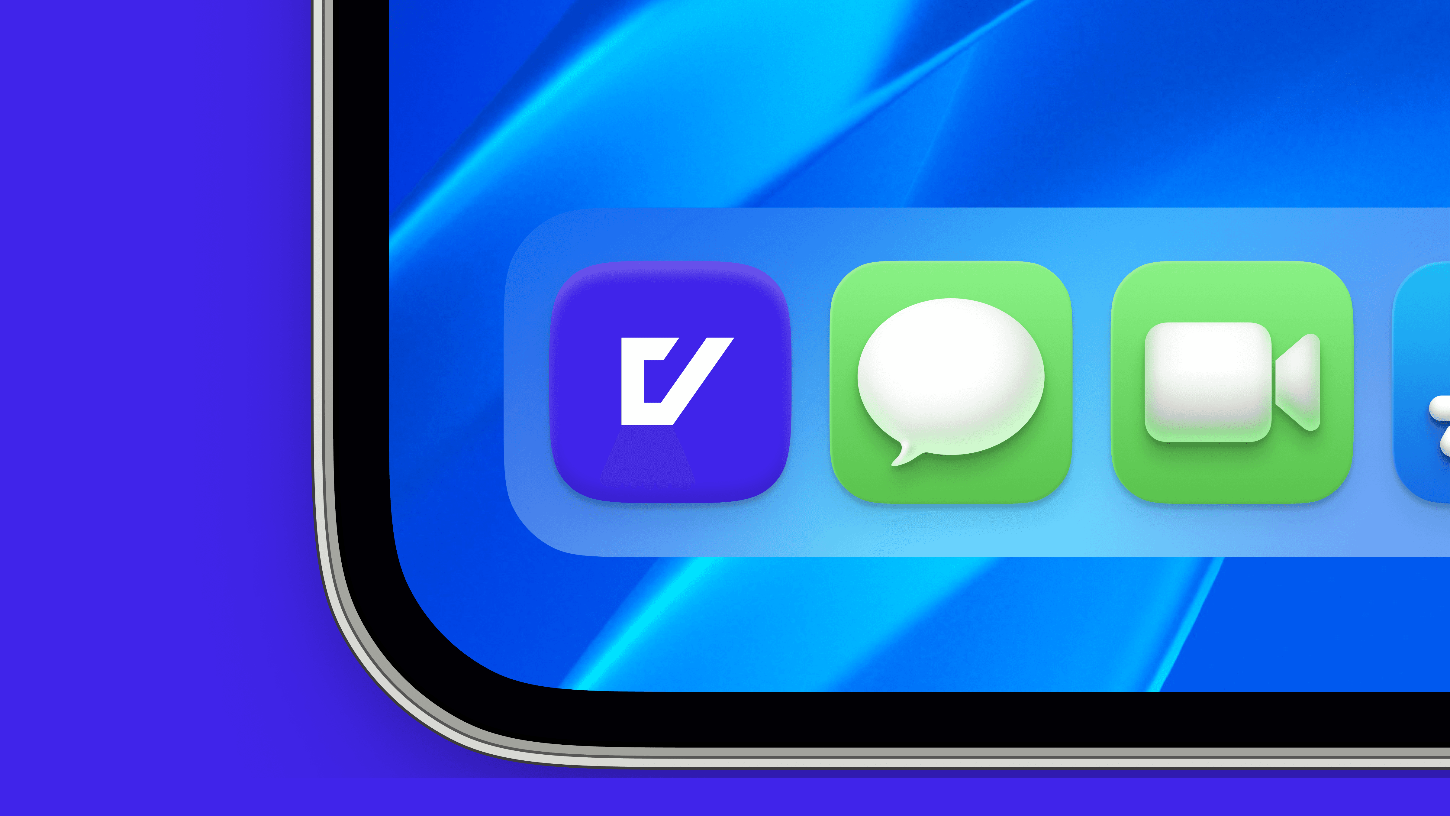
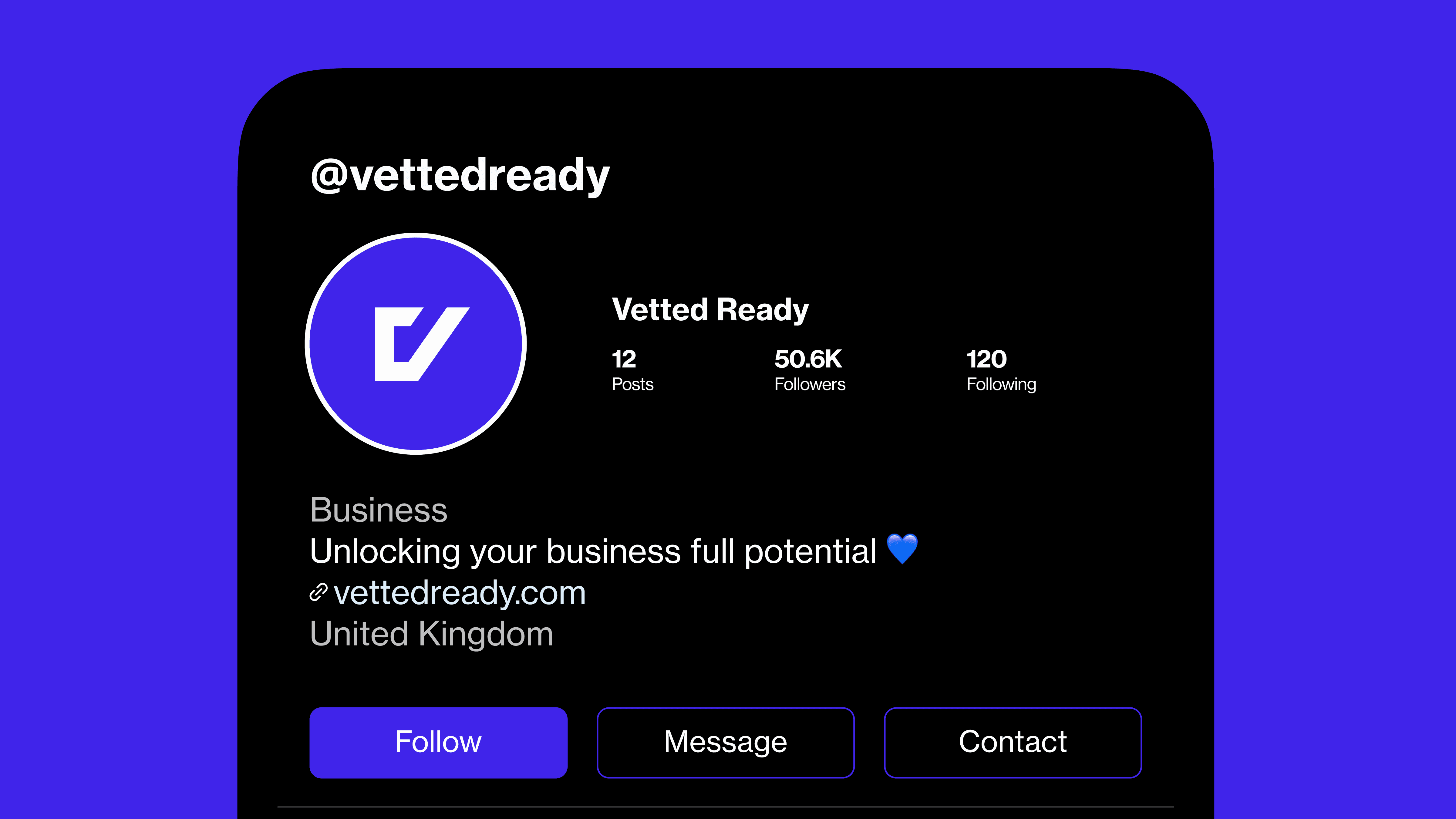
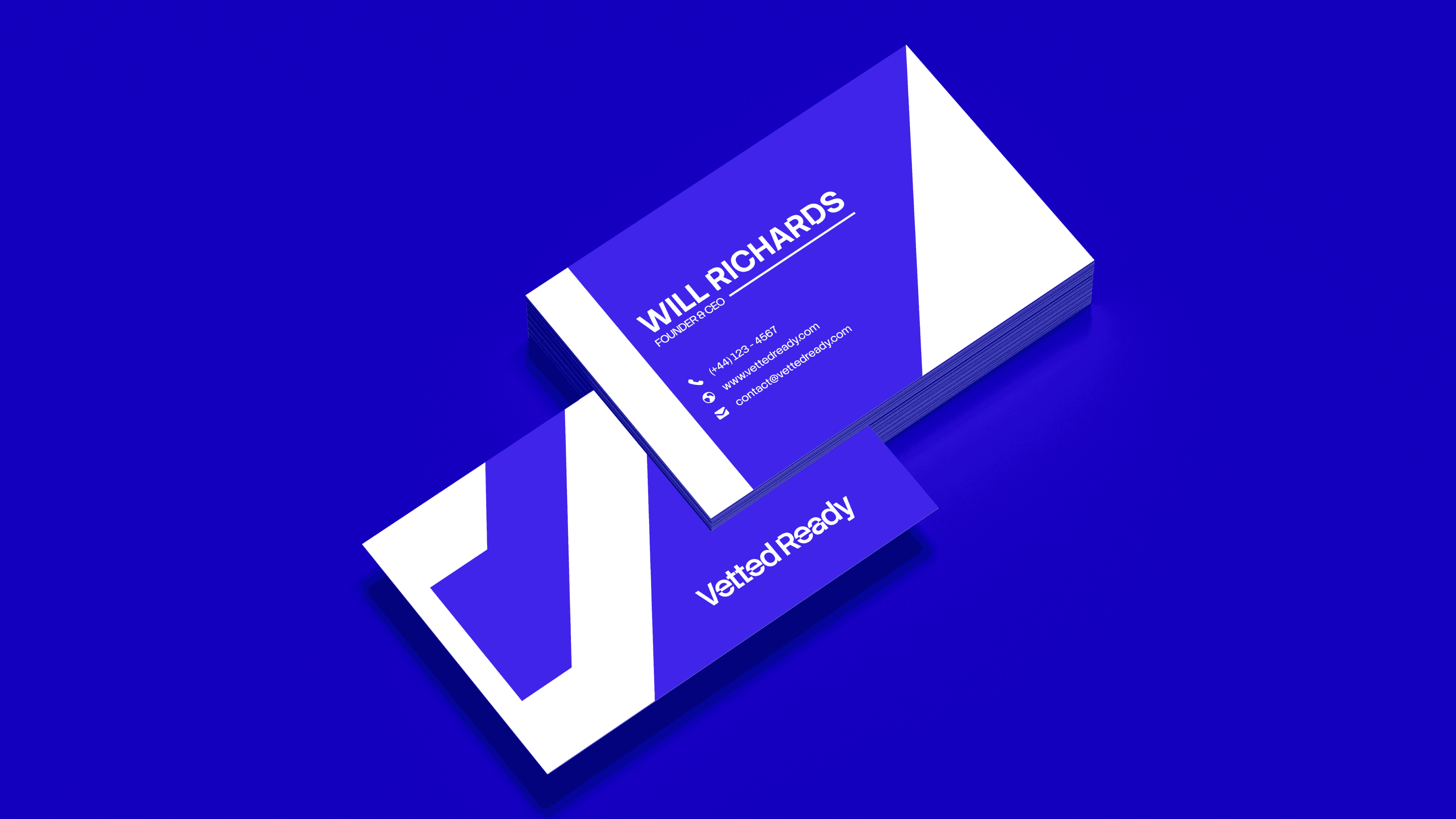
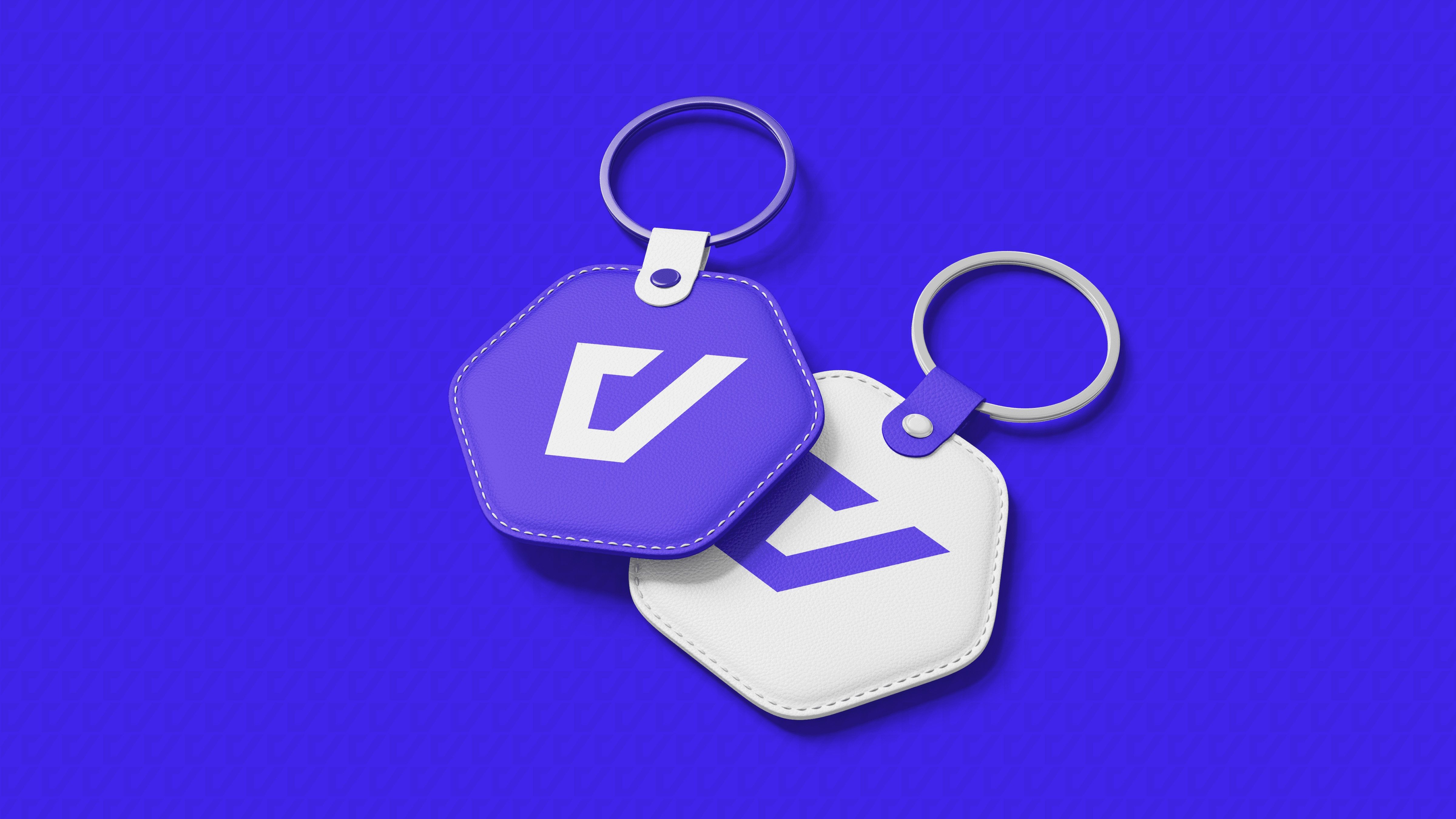
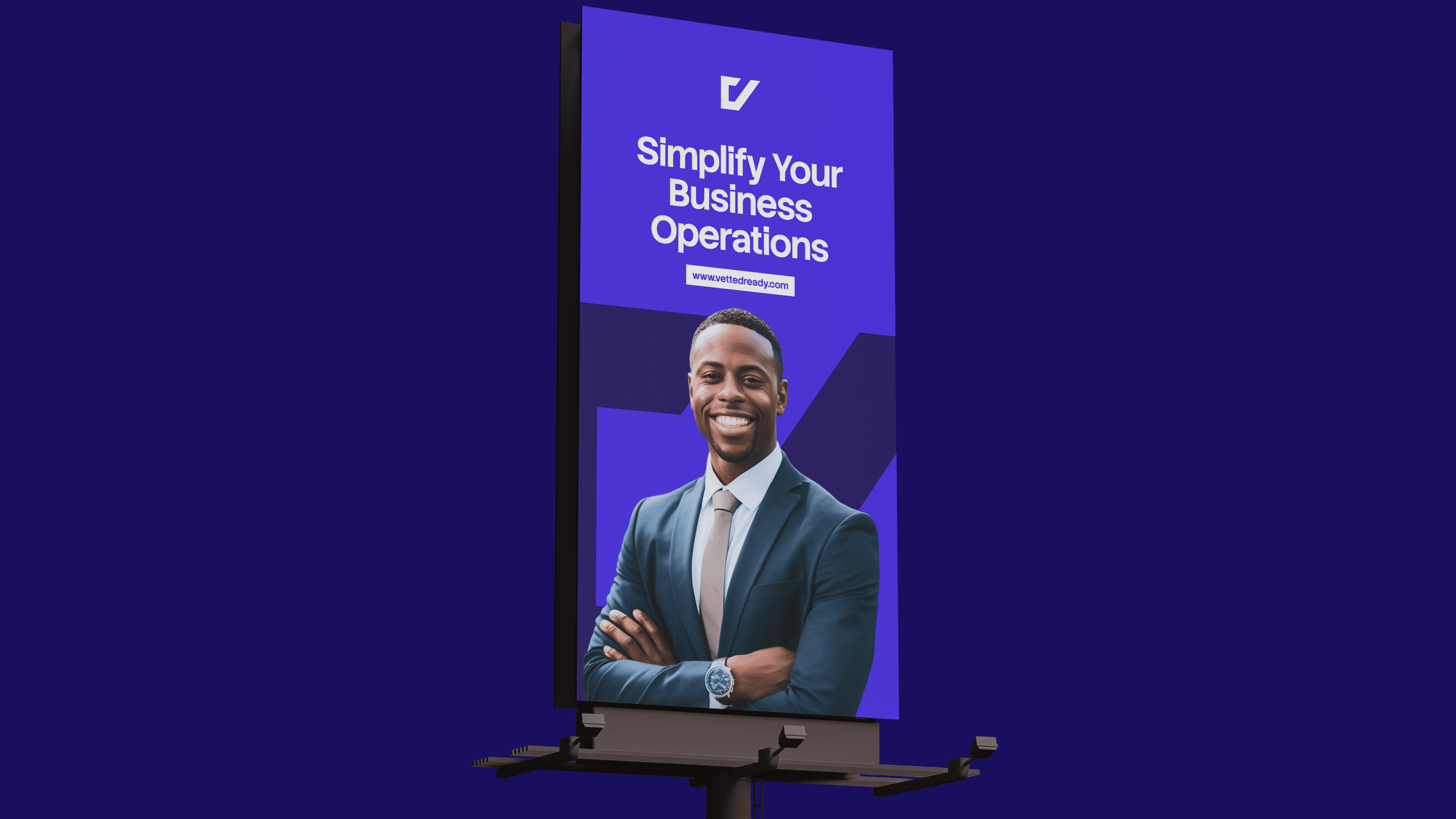
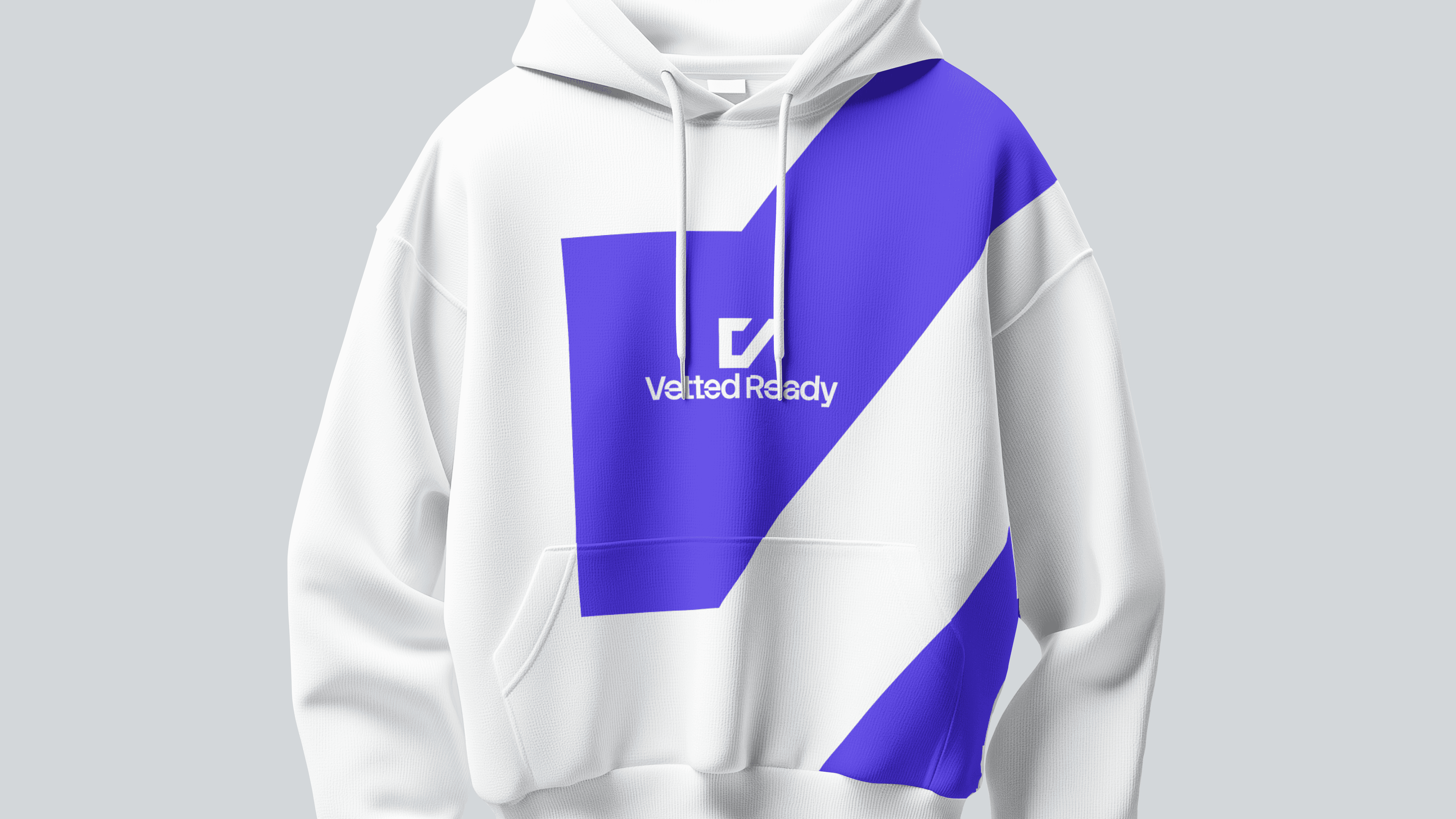
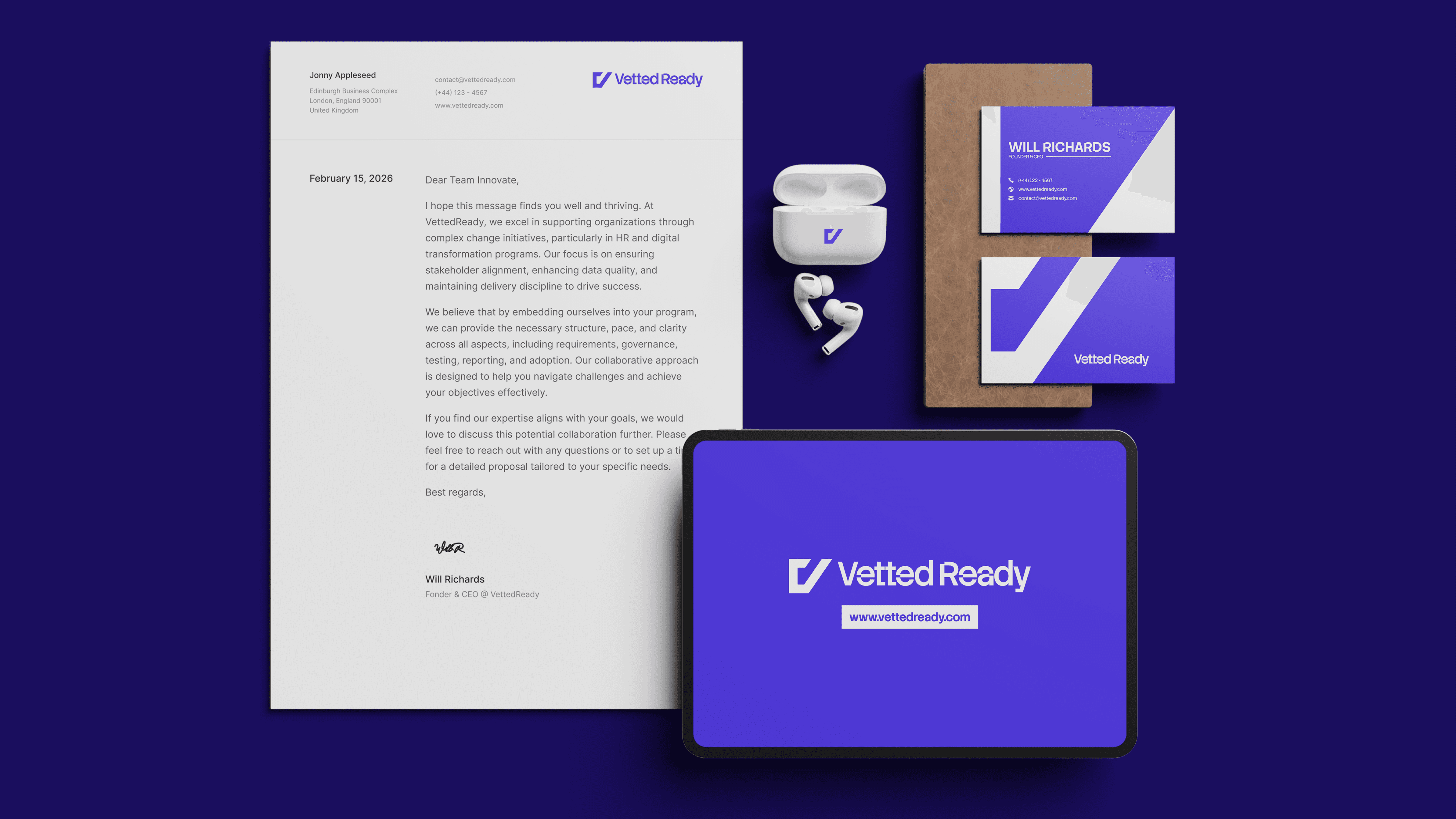
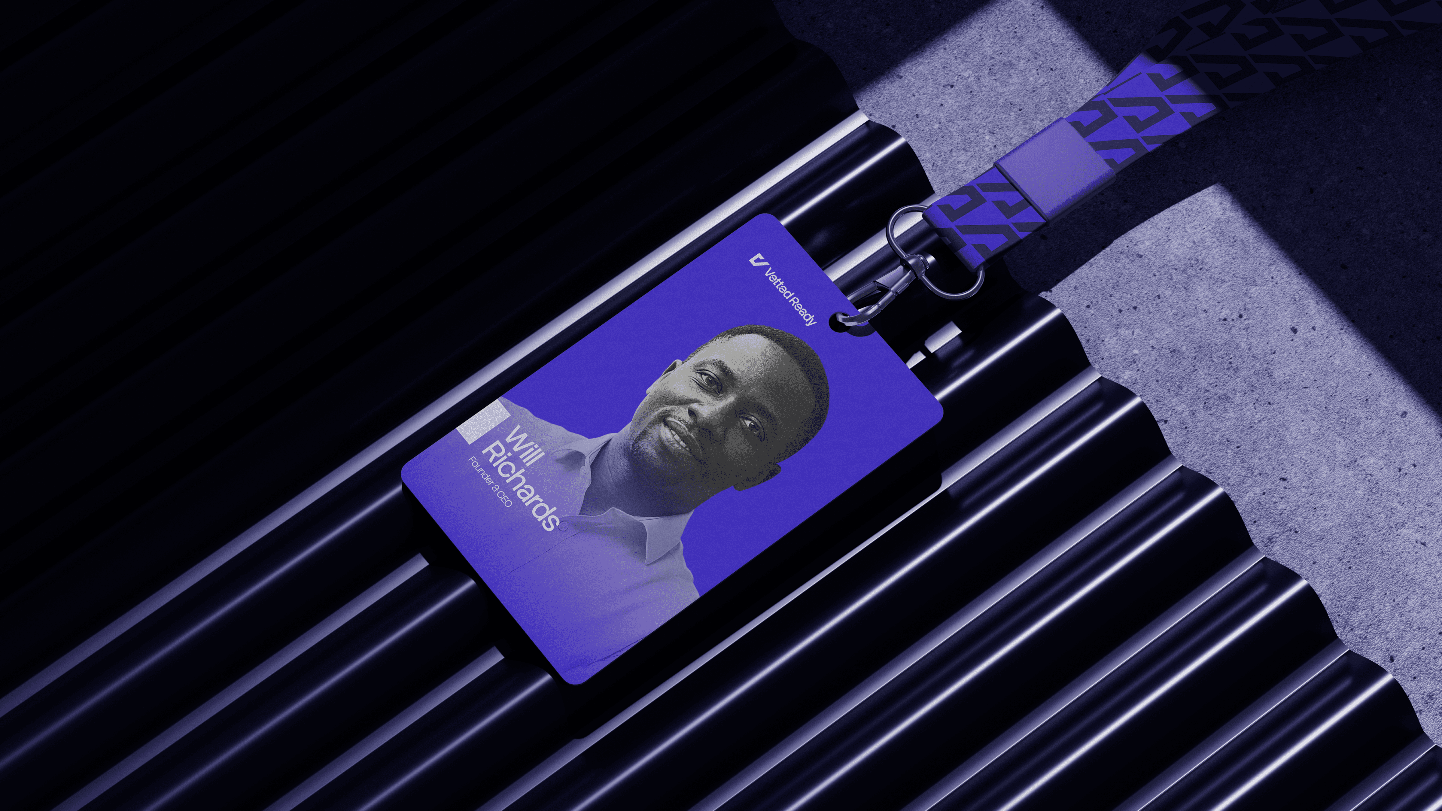
The resulting identity is built around the concept of "The Mark of Competence." Moving away from generic tech abstraction and created a visual language rooted in verification and governance. The logo identity does not just look "nice"; it functions as a seal of quality that assures clients the work is done right, and assures professionals they are ready for day one.
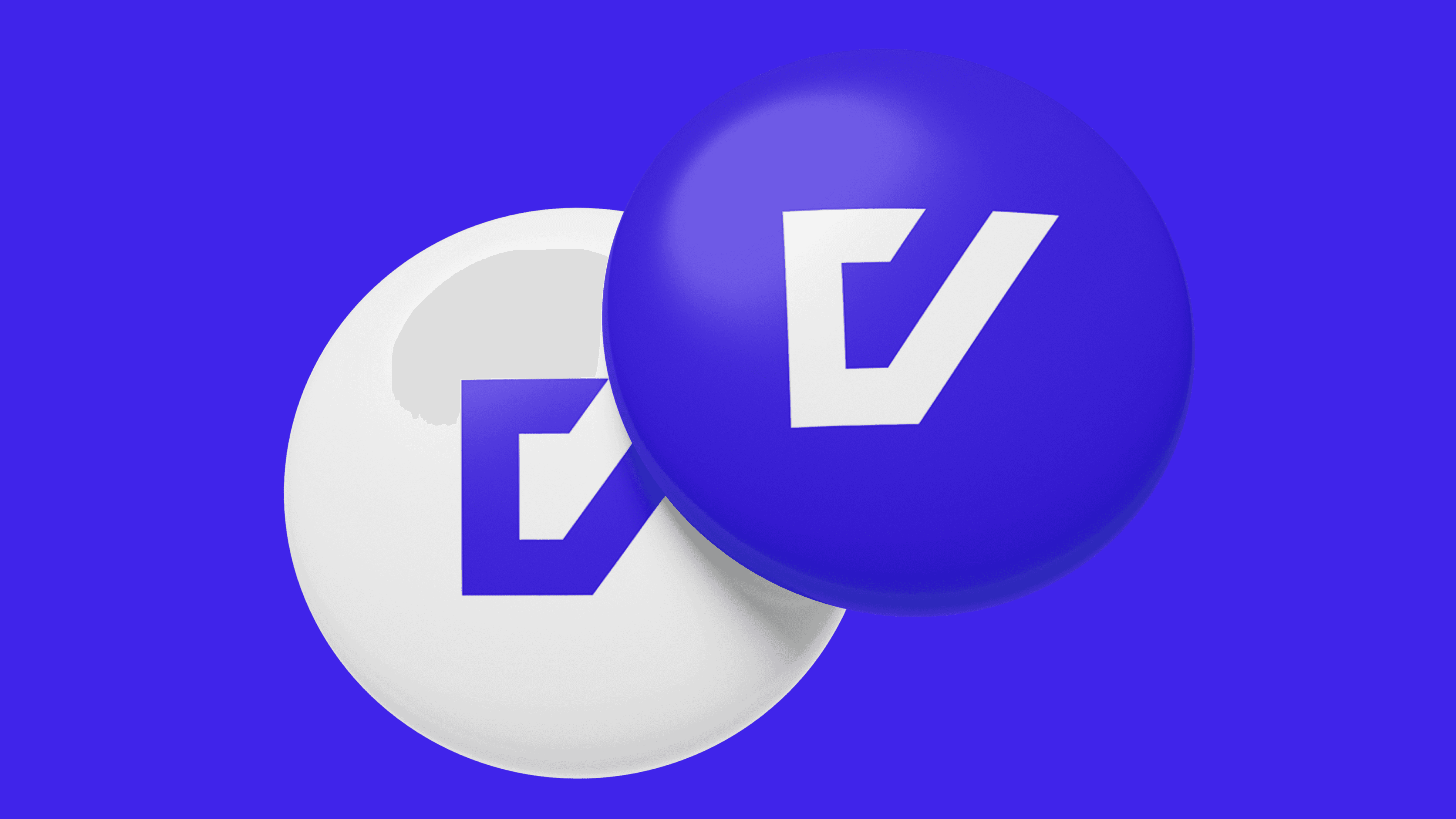
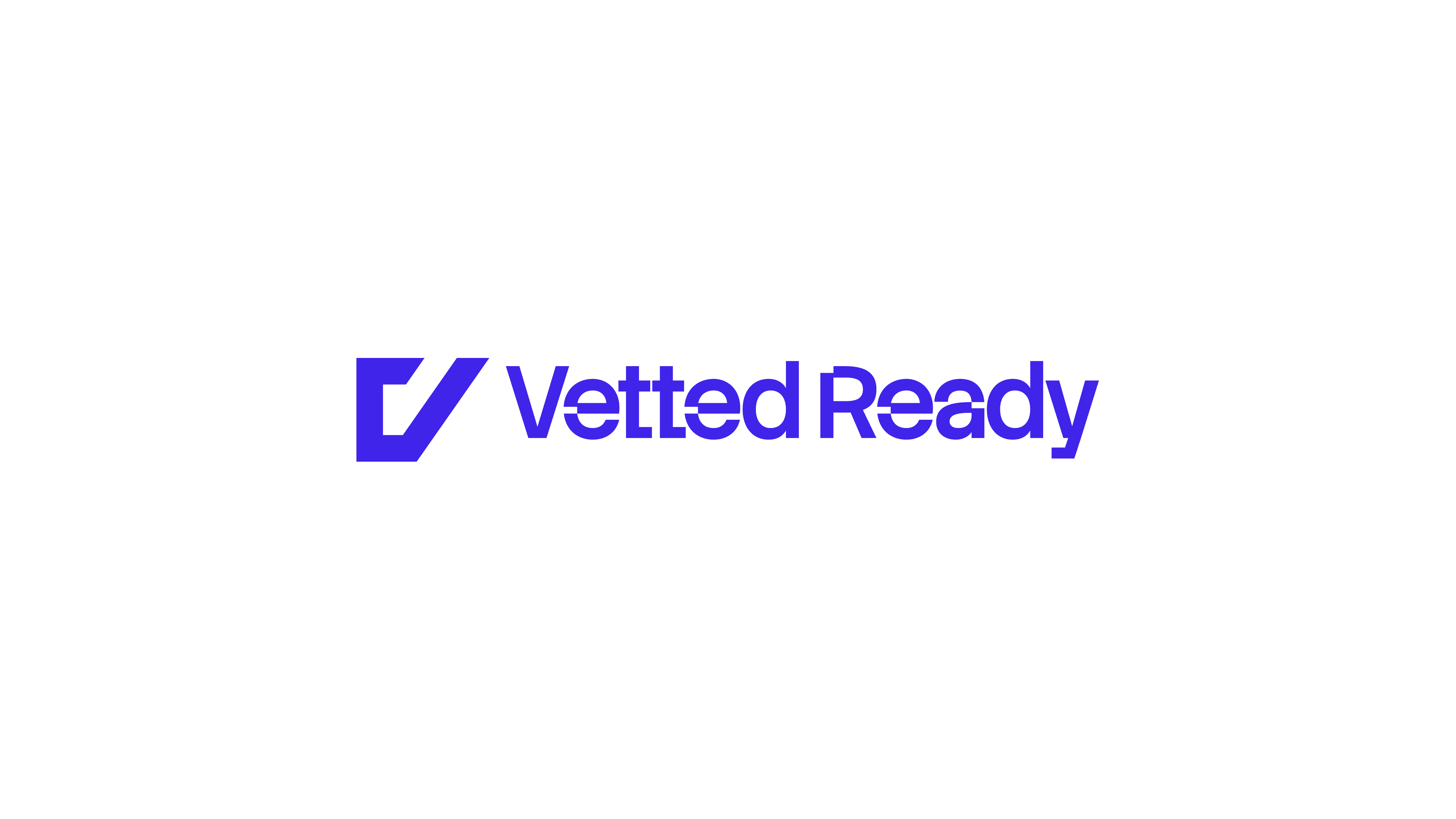
Logo Concept
The logo features a geometric monogram that merges the company name with its promise, designed as a "Stamp" for thorough checks and approvals.
The 'V' Container symbolizes Governance, representing the framework Vetted Ready offers for managing complex systems.
The Checkmark in the 'V' signifies being "Vetted" and "Ready," indicating task completion and approval.
The upward arm of the 'V' represents Transformation and Growth, reflecting the journey from training to independence.
This identity drives the brand by instilling trust, unifying the mission for both B2C and B2B, and differentiating through clarity.


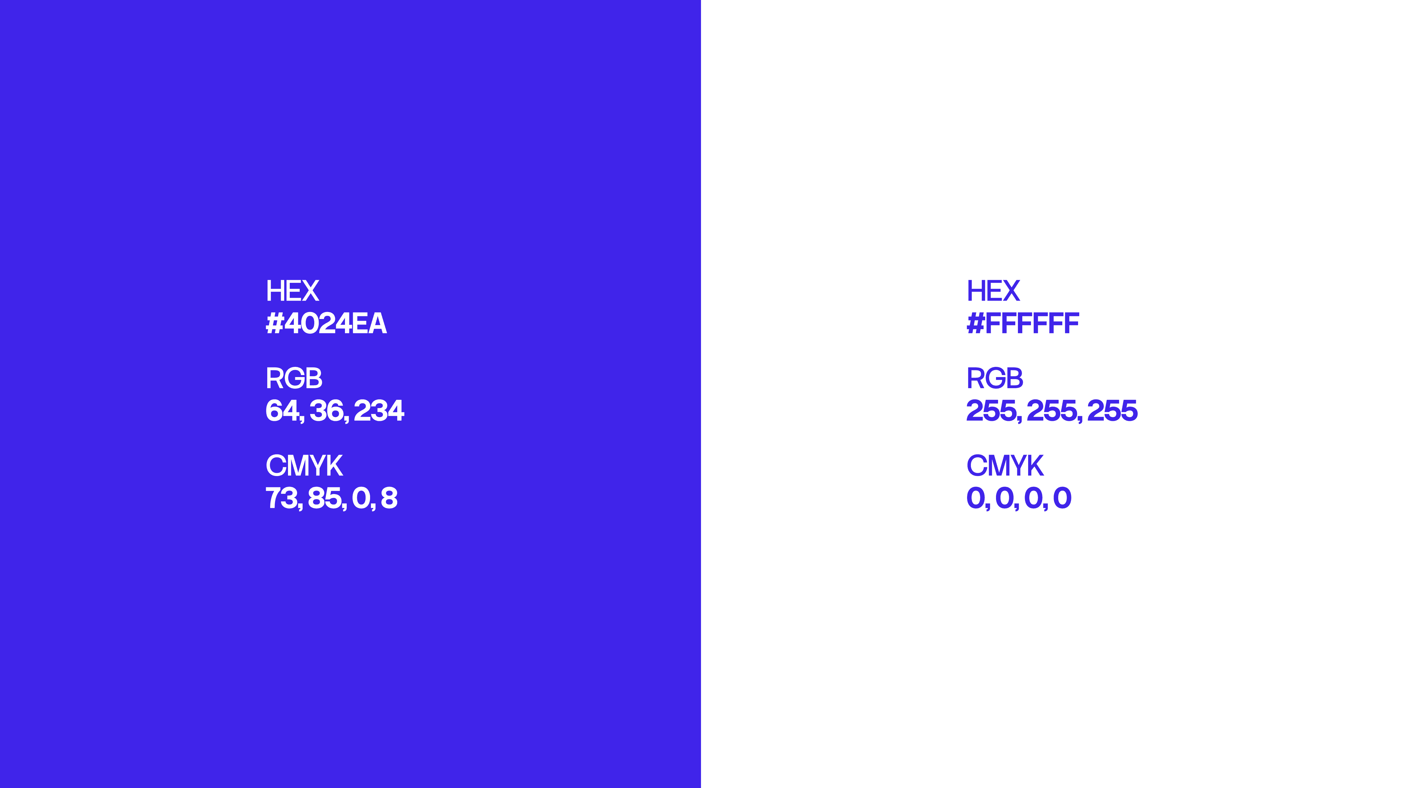
If Consultation Had Colours
Vetted Ready uses a high-contrast pairing of Vivid Royal Blue (#4024EA) and Pure White (#FFFFFF) to establish instant credibility.
Royal Blue: This colour was selected to evoke a sense of corporate stability, intelligence, and deep-rooted authority, which is essential for a brand handling high-stakes HR and digital transformations.
Pure White: Used to create a sense of clarity, transparency, and "outcome-led discovery," ensuring the brand feels organized and approachable rather than cluttered.
The Synergy: Together, these colours bridge the gap between high-end management consulting and modern, AI-enabled capability building
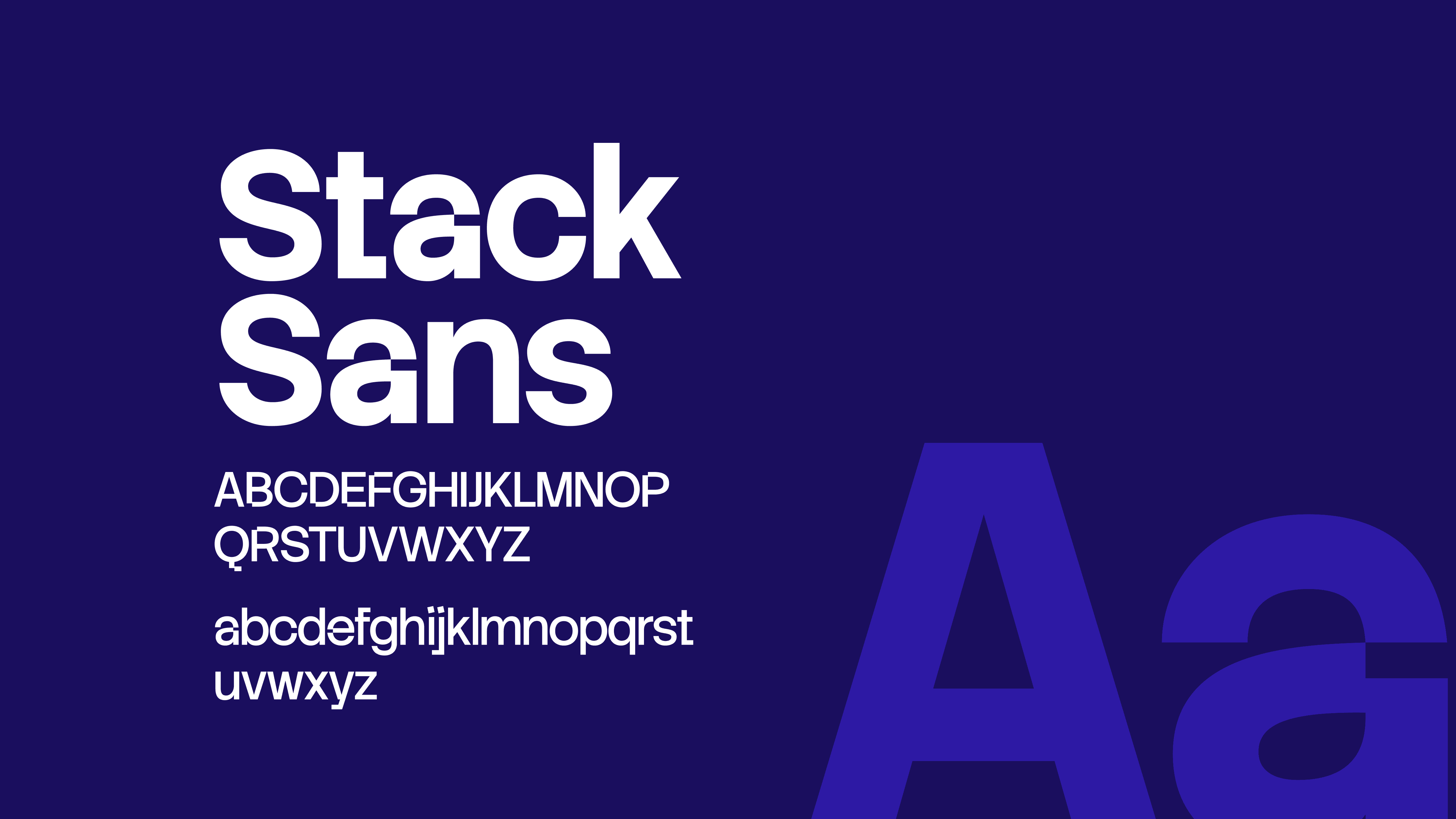
The Typeface
The primary typeface, Stack Sans, is a geometric sans-serif designed for maximum readability and a modern, professional edge.
Geometric Precision: The clean, uniform lines of the font mirror the brand’s focus on "disciplined methods" and "strong governance".
Accessibility: Its open and friendly structure ensures that complex information, from 90-day action plans to technical BA training, remains easy to digest for both corporate clients and career switchers.
Brand Alignment: By using a bold, sans-serif weight, the typography reinforces the "Ready" aspect of the brand, signaling confidence and day-one competence.
What a Journey
The visual identity for Vetted Ready successfully established a high-trust, "delivery-first" brand that resonates with both corporate stakeholders and individual learners. By unifying a bold geometric mark with a professional, authoritative color palette, the design:
Established Instant Authority: Positioned the brand as a credible partner for high-stakes HR and Digital Transformation delivery support.
Clarified the Dual-Service Model: Created a cohesive visual language that seamlessly bridges management consulting and career acceleration training.
Enhanced Information Clarity: Utilized structured typography and generous white space to make complex 90-day action plans and technical training modules easily digestible.
Communicated Quality Assurance: Reinforced the brand’s promise of "strong governance" and "vetted" outcomes through a consistent, seal-like logo application.